My Print Prelim:
For my print prelim the aim was to create a front cover and contents page for a college magazine.
Firstly I had to find an image suitable for the front cover,And with this a cover story. I chose the cover story "Alice Aces Art" an excellent art student who had won an award for her work.Then i did a photoshoot relevent to the key story that would feature on my front cover.
I followed a colour scheme in both the front cover and contents page of the magazine and matched the colour scheme according to what would be a typical colouir scheme that would be suitable for a college magazine, for example i used blues which arent too bright but are also not dull, for example i think the colour pink would be unsuitable for a college magazine because of its brightness which i think seems unappropriate for a college,whereas a blue seems more college appropriate.
I used a selection of relatively plain fonts that came with the photoshop software, for example 'Arial' and 'Tw Cen MT' i used these because i thought were suitable for a college magazine and didnt have to be too fancy.
However i did make the title stand out more by bolding the font, habing it the biggest text on the cover, and also applying the colour scheme by getting inspiration from the winstanley college logo which is on the front page on the award, making the title coordinate with this making it eyecatching and effective. I underlined the title sectioning it from the rest of the page resulting it in standing out more, making it obvious that it is the title.For the text in the banner across the bottom of my cover had a blue background around it as I wanted this text to stand out, as it is the main story of the issue in bold big text.
I then did 4 other cover stories on the magazine and seperated them into different headings on the page.I identified each story by backing them with a faded colour background to make them stand out from the picture on the background.
I included standard features found in the majority of magazines such as the date of release and bar code. Although I have used techniques I am happy with for a college magazine that i find suitable, I do not feel my front cover would be successful for a final piece of coursework. There are many things wrong with the cover of the prelim and many things i will do differently when making my final peice of work.
The image I have taken does not look particularly professional for a front cover as it is of poor quality,quite dark, and the image looks streched and elongated, and the background picture isnt clear and still quote dark, the colour of ther background is a grey/white which is boring and plain for a magazine,which would not be happy about for a final piece. Also, the text on the sides of the magazine look very basic combined with a plain font and roughly stuck ontop of a faded background which looks unproffessional.This would not be the case in a real magazine, so I would have to change this in my coursework. There is also quite a large gaps between the text which I could have avoided smaller, closer text or maybe the images brought closer.I will hopefully improve on this when it comes to making my final front cover in my coursework.
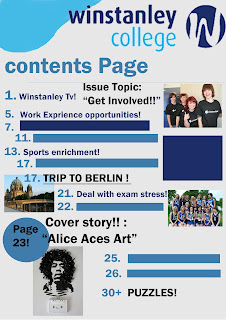
Print Prelim Contents Page:
This is the contents page made for my prelim. It is extremely basic and if it was to be used in a real magazine it would need much more detail, better fonts, and a much more organised layout. I followed the same colour scheme as my front cover to make the magazine a continuous style,and I used the same fonts as the front cover. As this is a prelim this is okay but for my finishee coursework i would need to put in much more professional detail for example text, pictures, and graphics.


