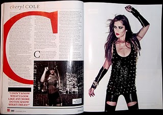
I also like this double page spread from 'Q'. Again i like how the main image of the artist is on one side of the double page, but i also like how there is more than one image on the page, this makes it look a little more interesting and gives two different viewpoints to the artist. Another think i particularly like is the big red 'C' for 'cheryl cole' as the background to the text, i think this is a very interesting approach to act as the background, without obstructing the reading ability of the text too much. Again i like the artist quote in the bottom left hand corner, this seems popular with double page spreads, therefore to make mine look as professional i must mimic these features.
No comments:
Post a Comment