Thursday, 3 May 2012

Final Photo

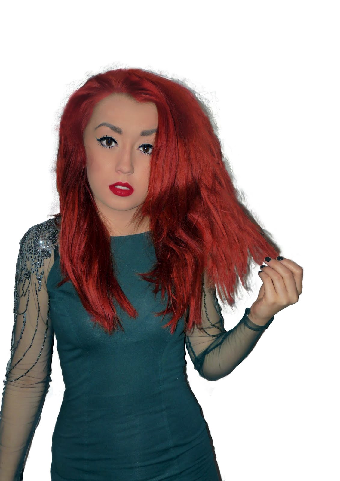
This is the cover photo that I have chosen, edited and removed the background of to go on my magazine cover.

Thursday, 15 March 2012

My Photo's

I then chose a few of my favoutes and edited them in photoshop.
I also removed the patterned background because i thought it would be hard to add text over it and read it clearly for my front cover. Natasha Is wearing a classy cocktail dress because this is the image i wanted to portray on my cover, I wanted it to be POP/RnB, and i wanted my singer to be classy and mature yet modern and hip.

Thursday, 8 March 2012

The first thing i did towards my magazine was chose a model and arrange a photoshoot in order to find photo's to go in my magazine.
I had to choose my model carefully as i wanted them to reflect the style of music that was going to be used in the magazine. I decided to use a single person on the cover to make the photo stand out and to present the main article in the magazine, in my case the girl singer on the front. I choose natasha as she listens to relevant singers and bands such as niki minaj,Rihanna, drake and chris brown which are all RnB style; the type of music that would feature in my magazine. She also has the right 'look' with the bright red hair that reminds me of the artist from the band Florence+the machine, and the singer Rihanna, i love the red hair because I think the vibrant colour of it makes the image stand out and looks appealing to the eye.

AUDIENCE RESEARCH

Creating My Title

Once I had decided on my magazine name:'VHM' I had to find an appropriate font. To do this I used the website 'dafont', I chose a font called 'PERPETUA TITLING MT' which is almost like 'TIMES NEW ROMAN' however a little bolder, because I liked the sharp yet bold look, i liked the edges of the letters and felt this would be suitable for the type of music magazine I am creating which would be modern yet mature and organised.
This is my title that I am going to use in my magazine. I decided to make it white over a red back-ground so it is bold and stands out and contrasts with the black and white theme of the rest of the front cover. I also added a shadow to make the look have a bigger impact. However depending on the cover photo i finally chose, i may remove the red background and have it transparent to allow the text to neatly over-lay the top of the photo to result in a clean professional look.

Magazine Name.

I Began to Think of names for my magazine.. My favourite two were 'Volume' and 'VHM'
I came to the conclusion VHM, ( Very Hot Music ) chosen because I believe the letters go well together, such as 'FHM' I prefer this title to 'VOLUME' because i believe a short title will be give more space to add text around my cover photo, 'VOLUME' would take up the whole of the top of the magazine cover, and VHM, just like 'NME' and 'Q' only takes up the left hand corner of the page.

Questionaire

I decided to create a questionaire in order to find out what buyers would want from a music magazine 1. What music genre do you listen to mostly? rock Metal Pop Indie Dance R 'n' B Other The Result was that most of the people chose RnB/POP 2. What music magazine is your favouite type?? NME Q KERRANG! Rolling Stones Vibe The Result was that most of the people I asked said Q 3. Would you prefer a band or solo artist on the front of the magazine? The Result was that most of the people i asked said solo artist. 4. Would you prefer a male or female artist on the front? The Result was that Most of the people i asked said Female.