
Thursday, 8 March 2012

Magazine Title Research
These are titles from rolling stone, I really like the font of the text of this one, i like how its original, and doesnt look like its been created by a typewriter. I particularly like the one in the first photo, because its cream/yellow yet has a darker outline to make it stand out more, and i also like where the other one is yellow against a dark background to let it stand out. I am going to adopt this in mine, making my title contrast to the background and maybe with an outline to add boldness.


 I do like the fact that the title of 'Q' magazine is short and simple and also therefore memorable, however i do think its a little plain and boring with not much to it, im going to try to avoid this style on my magazine.

 I Really like the NME title, because its short and simple, yet not as short as a one letter title. I like this because it doesnt strech across the full page and therefore gives more room for the image, however is not too short as to stay too far into the corner, i also like the light outline around it to make it stand out. However i particularly like the unique white bold title of NME.. i think against the brioght red background of the cover photo, it makes the white text really contrast and stand out. i think this looks really effective and makes the title stand out.


Inspiration For my cover.


Inspiration For My Magazine Cover.
I like the magazine covers where the cover photo is just of one artist rather than where there is a band on the front. I think the magazine covers with just one artist look more professional, organised and with more space to add text around it, i think the band covers look a little too busy and full, and it appears there isnt as much room for text around it.. for my magazine i am going to use just one person for the front cover.


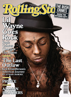


Rolling Stones Double Page Spread Research

Q Double Page Spread Research
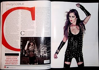
NME Double Page Spread Research

Subscribe to:
Posts (Atom)